I’m a designer and I’ve spent a lot of time inside Xcode lately.
This is not a sentence I would have expected to write a few years ago, at least not without adding something immediately after it to make clear I was mostly lost, mildly annoyed, and probably waiting for an engineer to rescue me from whatever I had just done to the layout.
But while we were working on Tapedeck, I made a pretty deliberate decision: I wanted more of the design work to happen directly in the app.
The first version of Tapedeck was designed the usual way. Figma files, handoff, implementation. And honestly, I didn’t like it. I didn’t like using it. A lot of things felt wrong — the flows, the interactions, the way it moved — and every time I tried to address something, I was doing it one step removed from the actual problem. I was drawing fixes instead of making them. That’s when I made the decision to change how we were building it.
Not in a dramatic “the old ways are dead” manner, even though I’m obviously using that as the headline because we all need to have a little fun. It was a practical decision. The normal design process felt too slow for the kind of product we were trying to make.
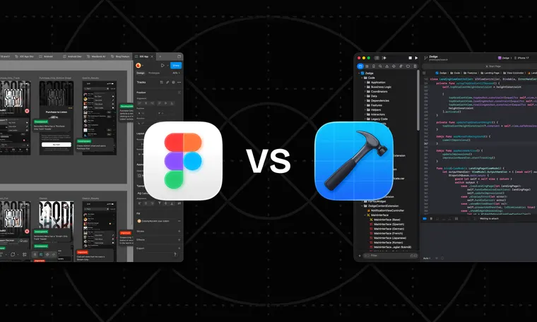
The Convincing Rectangle Problem
The usual process is familiar enough. You make screens in Figma. You talk through them. Maybe you prototype the parts that feel important. Then implementation begins, and only after the thing exists on a real device do you find out which parts of the design were actually working and which parts were just very convincing rectangles.
This is fine for a lot of things. It is also a surprisingly expensive way to answer simple questions.
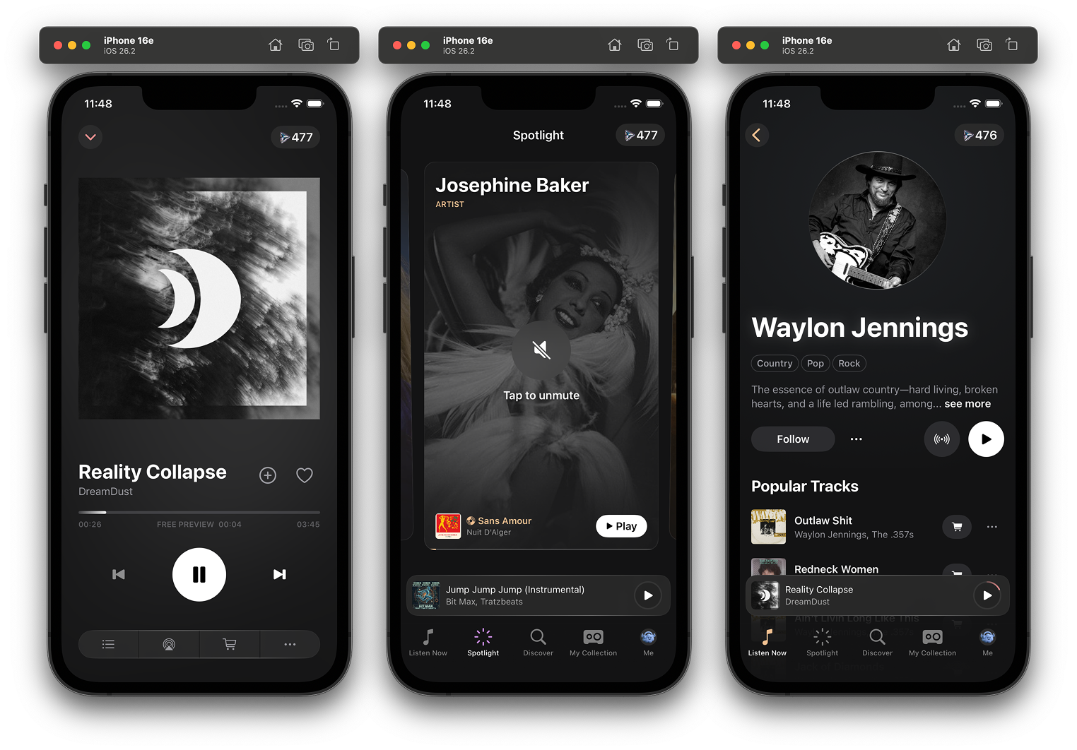
Music apps are particularly unforgiving this way. So much of what makes them work is interaction — the speed of getting somewhere, the feel of moving between a track and an album and a queue, the hundred small moments where the interface either gets out of the way or doesn’t. Tapedeck is non-linear in more ways than one. A static screen can’t tell you any of that.
With Tapedeck, there were many questions I did not want to answer in a design file. I wanted to answer them in the app. Does this flow feel too heavy? Is this action clear enough when you’re actually holding the phone? Is this empty state helpful or just decorative? Does the interface feel calmer if we remove something instead of adding another explanation? These are the kinds of questions where a mockup can help, but it can also lie to you very politely.
Moving Design Into a Repository
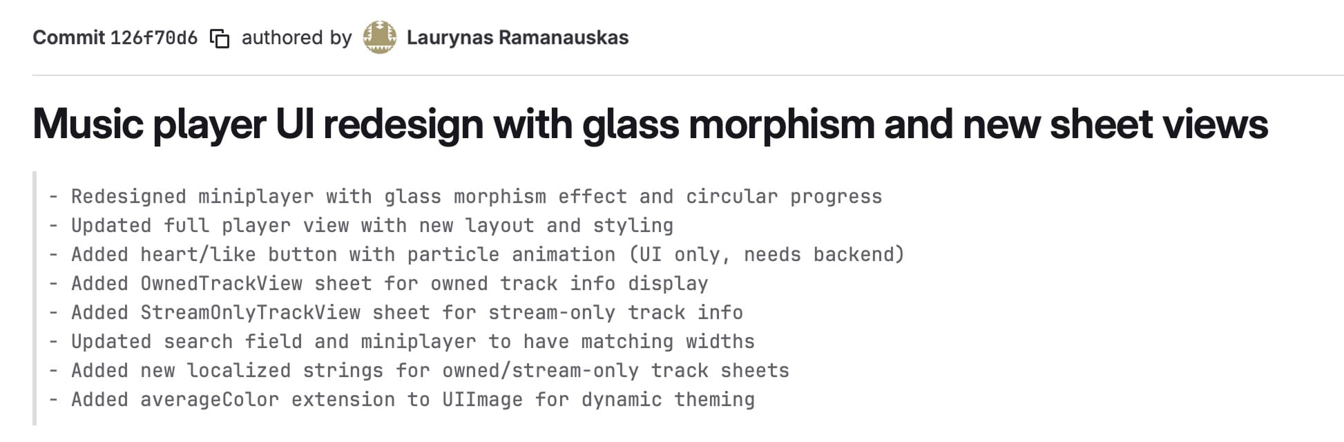
I started moving more of my work into the app itself, shipping actual code which is later reviewed by our engineers.
That meant learning new tools, but more importantly it meant learning the product differently. Cursor was a big part of it, so were other AI tools. But none of this worked by typing “make app good” into a chat window and waiting for a polished interface to fall out. I had to understand SwiftUI much better than I did before. I had to learn where things lived, how views were structured, how changes moved through the app, and which parts of the codebase I could safely experiment with without creating a small engineering incident.
I still created those sometimes. This is how learning works, apparently.
The useful thing about AI tools is that they made the codebase more approachable. They’ve lowered the cost of getting started, of asking dumb questions, of changing something and understanding why it broke. That last part is important, because when you start designing closer to the actual product, you also lose some of the comfortable distance that design tools give you. A Figma file will let you do almost anything. A real app is much less forgiving.
Ideas Have to Deal With the Product Earlier
When you design in the app, ideas have to deal with the product earlier. They run into existing components, real navigation, actual content, weird cases, platform behavior, and all the little constraints that usually show up later and ruin the purity of the design review. Sometimes that is frustrating. Sometimes you discover the thing you were excited about is awkward the moment it becomes real. Sometimes you spend too long trying to fix what appears to be a tiny visual detail and come away with a fresh respect for everyone who has ever said, “It’s a little more complicated than that.”
But the feedback loop is much better.
Instead of making a design, explaining the intent, waiting for implementation, reviewing the implementation, clarifying the intent, and then repeating that loop until everyone is tired of the word “polish,” you can try the thing directly. You can make a change, run the app, feel that it is wrong, change it again, and only bring other people into the discussion once there is something real to react to.
The Edges of the Job Expanded
AI tools did not make my job smaller. They made the edges of it expand.
If I can work directly in the product, then I am suddenly responsible for more of the product. I need to understand how the interface is built, not just how it should look. I need better technical intuition. I need to know when I’m making a harmless visual tweak and when I’m pulling on a thread that connects to something bigger. I need to be able to talk to engineers with more precision, because “this feels off” is still useful, but “I think this view is doing too much and we should split the interaction here” is a much better starting point.
That does not mean every designer now needs to become a full-time engineer. The point is that the wall between design and implementation has become thinner than it used to be. If the tools now allow designers to work closer to the product, then staying far away from the product starts to feel like a deliberate choice.
The Overconfidence Problem
There is also a slightly uncomfortable side to this. AI tools can make you overconfident very quickly. They are helpful enough to get you moving, but not reliable enough to remove judgment from the process. They will suggest things that technically work but do not belong in your app. They will happily invent patterns if you ask vaguely enough. They can make a bad idea available faster, which is not the same as making it better.
So the job becomes less about producing more and more about knowing what to keep.
That part feels very familiar, because it is… Design!
Instead of working only with layouts, flows, prototypes, and annotations, you are also working with actual components, real behavior, and the production environment where the thing will eventually live anyway.
Translation Is No Longer the Point
The old version of design implementation was mostly translation. Design happened over here, implementation happened over there, and everyone tried to preserve as much meaning as possible while moving the work from one place to another.
Now, implementation’s become part of how design decisions are made.
Designing in code does not make the process cleaner. In some ways it makes it messier, because the real product is far more complicated than a design file. But it makes the work more honest. It forces ideas to become real earlier. It makes technical constraints visible sooner. It makes collaboration with engineers more specific, because we’re no longer only talking about what something should become; we’re looking at what it’s doing right now.
More Interesting Than Another Static Screen
Designers are being asked to understand product, craft, systems, technology, writing, motion, usability, and now increasingly the production layer itself. That is a lot. It is also, if I’m being honest, more interesting than handing off another static screen and hoping all the important bits survive the trip.
The new kind of design implementation is more involved, more technical, and much harder to hide from. It asks designers to get closer to the thing they are designing. It asks engineers to work with design as something that continues inside the product, not something that arrives fully settled from another tool. It makes the repository feel less like a destination and more like a workshop.
Workshops are messy and full of ways to hurt yourself. But they are also where the thing gets made.