As a Zedge Content Manager, I browse through countless artist profiles each day, and it’s become clear to me how some shine where others fall short.
What makes the difference between a profile we choose to promote and one we pass over? In this post, I’ll share some behind-the-scenes insights into how Zedge approaches content promotions: what we look for, what we avoid, and how artists can best catch our attention.
How we screen profiles for promotion
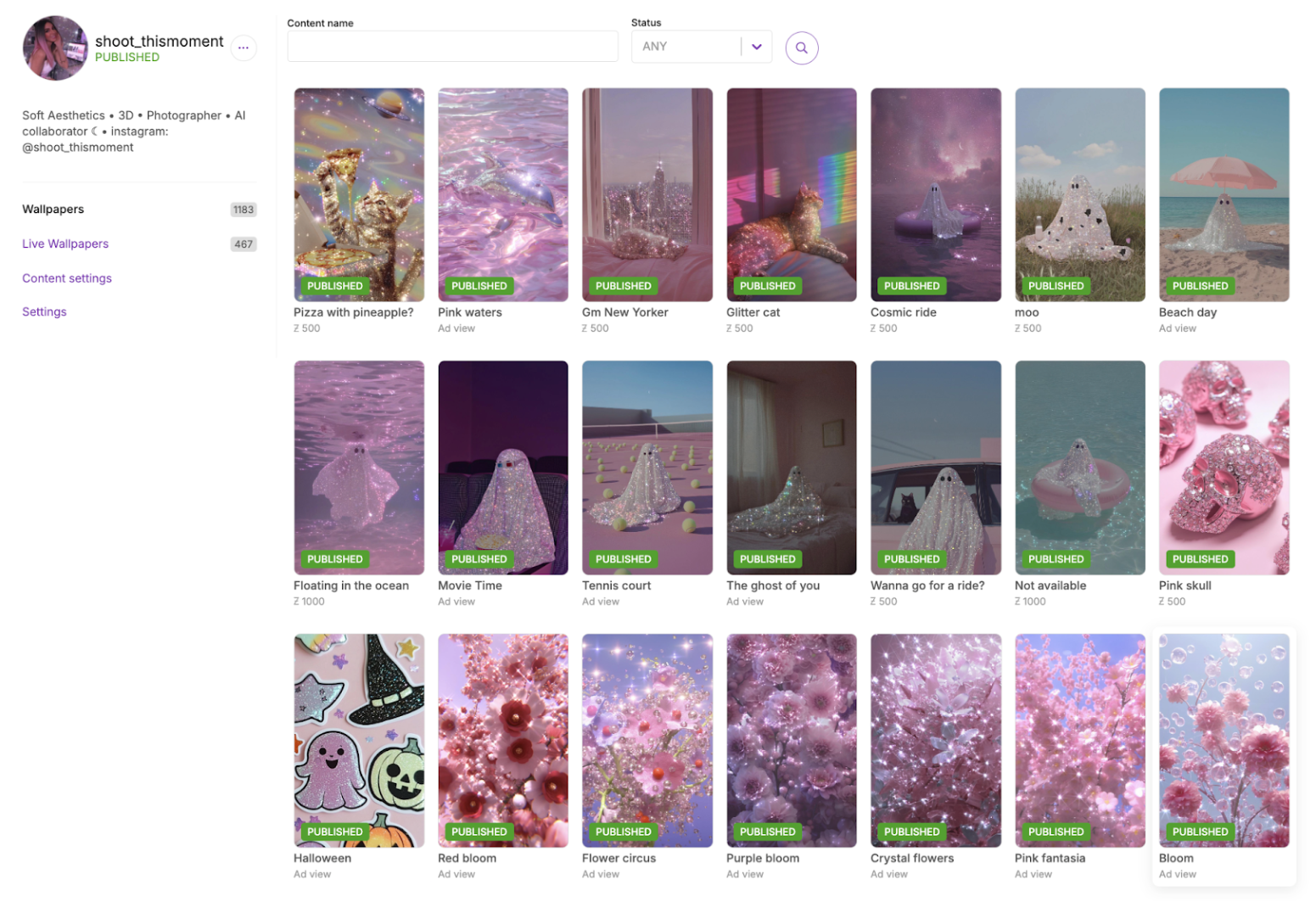
Our screening process begins with a daily check of recent feeds, where we look for items that stand out from the rest. Once a unique artwork captures our attention, we dive deeper to assess how well it aligns with current trends and to review any other profiles from the same artist to get a comprehensive view of that artist’s work. Creators with high-quality art across their portfolio make the strongest first impression – and you never get a second chance to make a first impression!
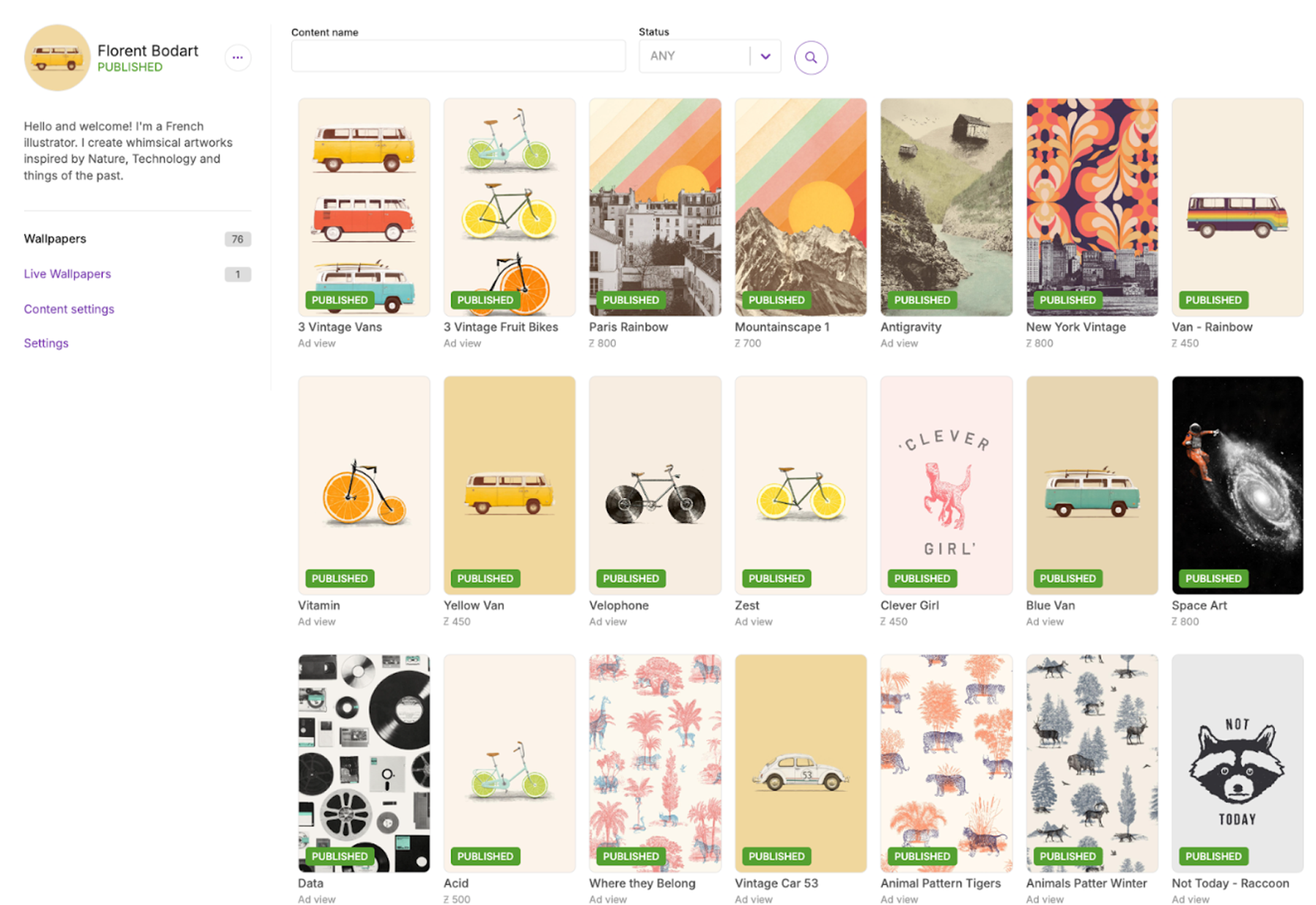
It feels rewarding to find a profile with a clear description, a well-chosen cover image, and consistently good art. However, such coherence is not always the case – too often, when checking other profiles from the same artist, we'll find many that do not demonstrate the same care. When that happens, we are unlikely to feature the artist.
What we value
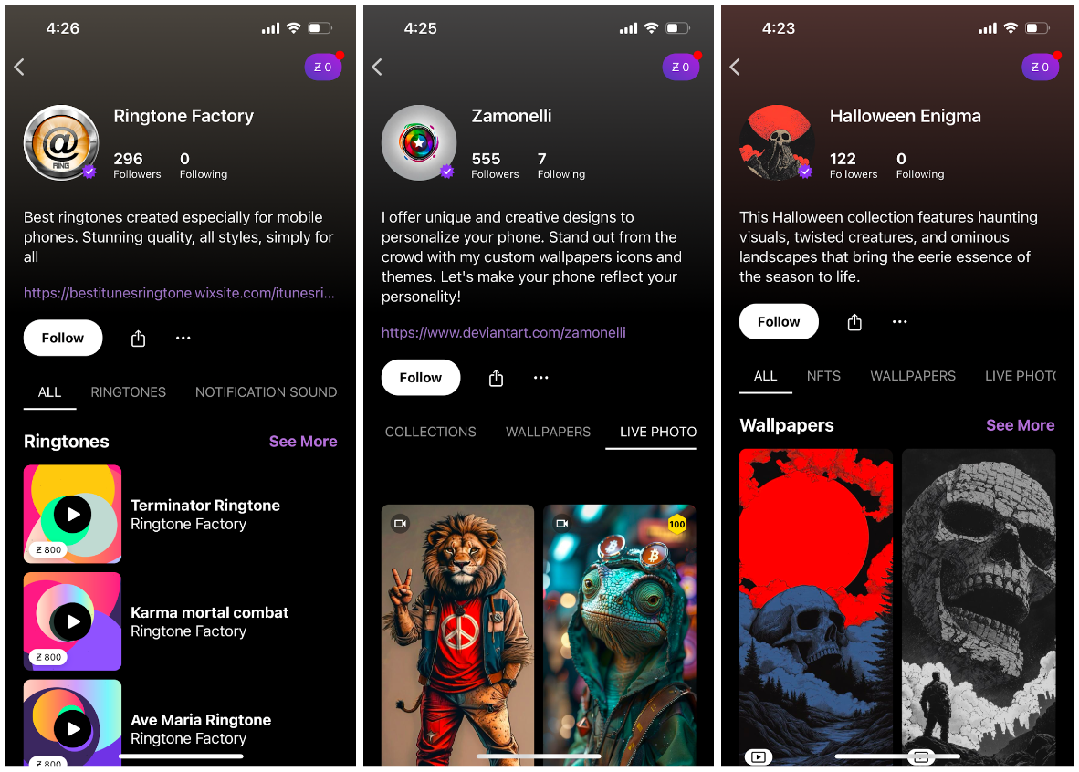
Profiles with high quality and unique art are most important. The next things we look for are clear item titles, and non-repetitive tags and descriptions for the profile and all its items. As the saying goes, “How you do anything is how you do everything" – quality extends beyond the artwork. The profiles we love most are the ones that demonstrate as much care for their metadata as they do for their art – that gives us confidence that the artist will continue to create a great experience for our users.
Profile images are also crucial, as they provide the first impression for users scrolling through long lists of artists. The best creators thoughtfully avoid using the same image across all their profiles; the ones who don't can seem repetitive and uninspired. We want to support artists who bring fresh, engaging visuals to all their work.
We are especially enthusiastic about profiles that maintain consistency around a few main themes – but not too many! We appreciate variety within those themes, showcasing items that are unique yet cohesive without exact repetition.
What we avoid
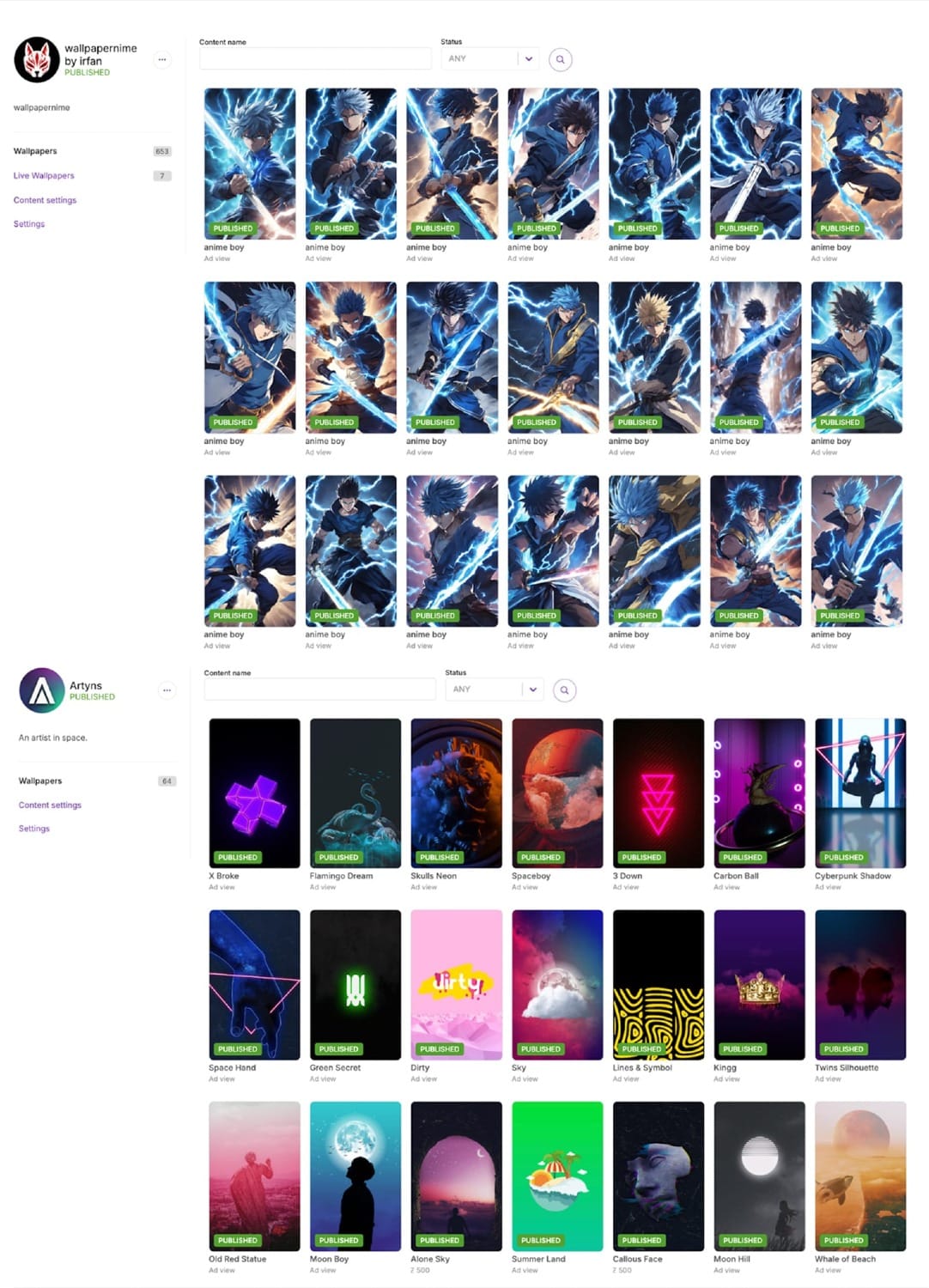
We often see artists start strong, with unique, attention-grabbing items. Too often, however, some such creators eventually shift toward repetitive or bulk uploads, diluting their impact and making them seem less thoughtfully curated. Such a change is always disappointing, as it’s sad watching the originality and creativity that first intrigued us begin to fade.
Such dips in quality and/or over-reliance on repetitive content caution us against promoting an artist, as these factors also affect how users experience the content. Continuity in quality is essential to maintaining user engagement and trust. Our goal is to promote profiles that stay true to their creative identity while continuing to surprise and engage, rather than profiles that feel overly formulaic over time.
Challenges
When we speak of consistency, we do not mean to suggest that every item should be nearly identical. Instead, we are looking for a cohesive theme throughout the profile's work. This might mean that items share related subjects, colors, or styles rather than jumping abruptly from, say, nature or animal imagery straight to abstract patterns or spiritual icons. Maintaining an aligned style, color palette, or thematic focus helps create a professional, appealing portfolio.
Artists who enjoy exploring a wide range of different themes can do so by creating separate profiles for each theme; the best ones do so with purpose. Profiles with a clear and focused theme are more visually cohesive and engaging for users, while also showcasing that artist's creative versatility in a structured way. By thoughtfully organizing their work, they enhance its appeal and avoid the impression of simply trying to game the feeds.
Issues with low quality content
Low-quality content, such as poorly cropped, stretched, or composed photos, can significantly detract from the overall appeal of a profile. These types of images look unprofessional and fail to showcase the artist’s full potential. Content presented in such a manner creates a negative first impression that makes it difficult for us to take the profile seriously, which lowers the likelihood of Zedge ever featuring the artist.
AI can be a great tool for creating amazing, eye-catching artworks, but not everything AI-created is qualified to be uploaded as a wallpaper. AI images often come with frustrating quirks such as obvious spelling mistakes, weird artifacts, or distorted details that make them look amateurish or unnatural.
To avoid these problems, it’s best to be highly specific with one's prompts. The more detail one gives the AI, the less likely it is to make weird mistakes. AI-based image upscaling or inpainting tools that intelligently fill in missing or broken areas can be used to address issues such as distorted faces or body parts.
How we select items for celebration and general modules
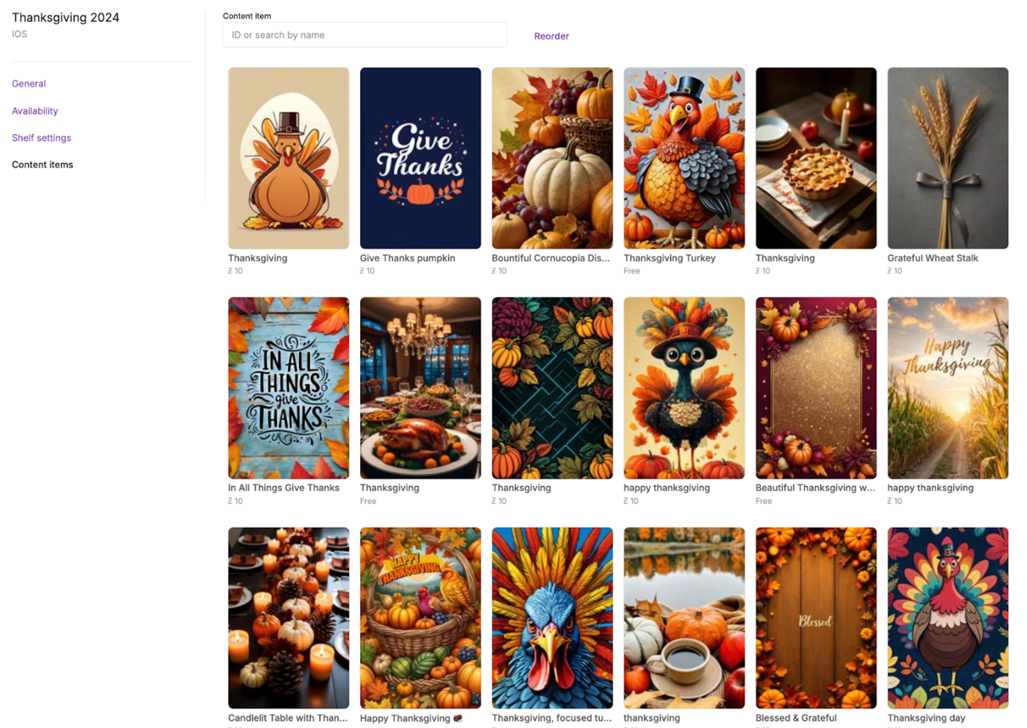
When picking content for modules and celebrations on Zedge, we focus on finding artwork that really captures the essence of any theme or event we're likely to be promoting. For something like a holiday, we’re looking for images that evoke the right atmosphere, such as cozy winter landscapes for Christmas; vibrant fireworks for New Year’s; or fun, spooky graphics for Halloween.
Color palette, mood, and language matter a lot, too. Items that communicate a personal style within a broader theme always catch our attention. For instance, we might take popular motifs of fireworks for New Year's or hearts for Valentine's Day and mix them with fresh patterns, fonts, or textures to make them feel one-of-a-kind. We also pay attention to color harmony and clarity, making sure each image will look great on a variety of devices.
General advice for artists
If you're an artist uploading work to Zedge, be authentic and avoid copying others’ art or uploading low-quality pieces. Ensure each item maintains the same high standards to maximize your chances of being promoted. Diverse and unique items, even within a single theme, are more likely to catch our eye and make it into featured modules.
Whether you're creating something from scratch or modifying existing images, the key is to choose colors, textures, and themes that resonate with you. For inspiration, you can look to nature, photography, graphic design, or even pop culture. Apps such as Adobe Spark or Canva provide tools to easily create custom wallpapers, helping you experiment with layouts, filters, and typography.
By mixing and matching elements you love, you can design wallpapers that feel personal, reflect your style, and make us take notice.
